


Juxtaposition Styling: How 2024 RUINED Another Outfit Formula
and why so many of you get it wrong

Fashion trends are constantly evolving, but lately, I’ve been noticing something that doesn’t quite sit right with me. There's this overwhelming urge to be “different” by doing things wrong on purpose: pushing boundaries with mismatched pieces and clashing styles. But is it truly rebellious or just another way to stay relevant in a digital world? Let’s dive into that.
WORD KEY
FOOTBALL=”SOCCER”
Disclaimer: I’m aware that my opinions come from my own personal tastes, and just because something doesn’t work for me doesn’t mean it won’t work for you. If you feel good in what you’re wearing, even if it’s something I’ve critiqued here, don’t let my perspective discourage you. I know my tone is bold, sometimes harsh, but at the end of the day, my goal is simply to encourage people to be more reflective about what they consume, to slow down, to think. But if you’re already confident in yourself and your style, then wear what you love because that’s what fashion should be about :3
Remember 2024? The year where everything and nothing was trending at once? Aesthetics came and went at lightning speed, micro trends overlapped until they blurred into one, and the sheer volume of fashion cycles made the year feel like it had two separate eras. But amidst the chaos, one styling “hack” dominated the scene:
“juxtaposition for the sake of juxtaposition.”
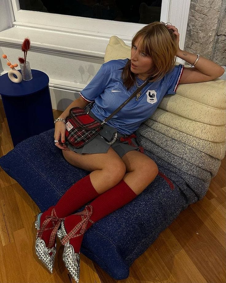
Take ‘blockettcore’, for example; the aesthetic mashup where football jerseys met frilly skirts, moto boots, and cowboy boots.
At first, it felt fresh, playful, even a little rebellious. As a football fan, I loved the idea of “girlifying” my game day outfits, merging my love for the sport with a hyper feminine twist. But then, the internet did what it does: oversaturated the trend until it lost all originality. Suddenly, every jersey was drowning in bows, lace, and layers of exaggerated frills, turning what was once an unexpected pairing into a predictable formula.
The silhouette; puffy skirts, tight tops, layered skirts over jeans became a costume rather than a statement.
This wasn’t just a blockettcore’s issue; it was the issue of 2024 fashion scene. The obsession with layering, clashing aesthetics, and chaotic styling wasn’t about personal expression anymore, it was about gaming the algorithm and standing out for the sake of attention.
Fashion became basically a visual stunt, designed not for real life but for engagement. And here’s the problem: just because something is visually interesting doesn’t mean it’s actually stylish. The more we saw it, the less impact it had.
Of course, over time, certain aesthetics will gain traction, and what once felt personal might suddenly be labeled a microtrend. I get how frustrating that can be, no one wants to be seen as the final boss of fleeting fashion. But the reality is, trends will happen whether we like it or not.
That said,I don’t want to necessarily invalidate this way of styling as I am aware that for many people use this “cheat code” and it is how they enjoy getting dressed, infact I want to dissect the trend and also inform and share my own opinion on how you can incorporate this way of styling into your personal wardrobe.
However, there’s a difference between thoughtful juxtaposition and clashing pieces together just for the sake of it, in the name of fashion.
When it comes to styling an outfit, you can juxtapose any number of elements: feminine vs. masculine, oversized vs. fitted, athletic vs. chic but the real challenge is ensuring that these combinations still work in a functional context. There’s nothing wrong with experimenting, but if an outfit becomes completely impractical, that’s where it can fall apart for me.
Let me show you examples of juxtaposed styling that works (for me) and the ones that completely miss the mark.
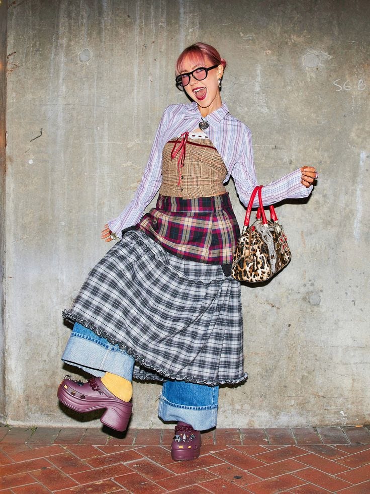
When Juxtaposition Misses the Mark
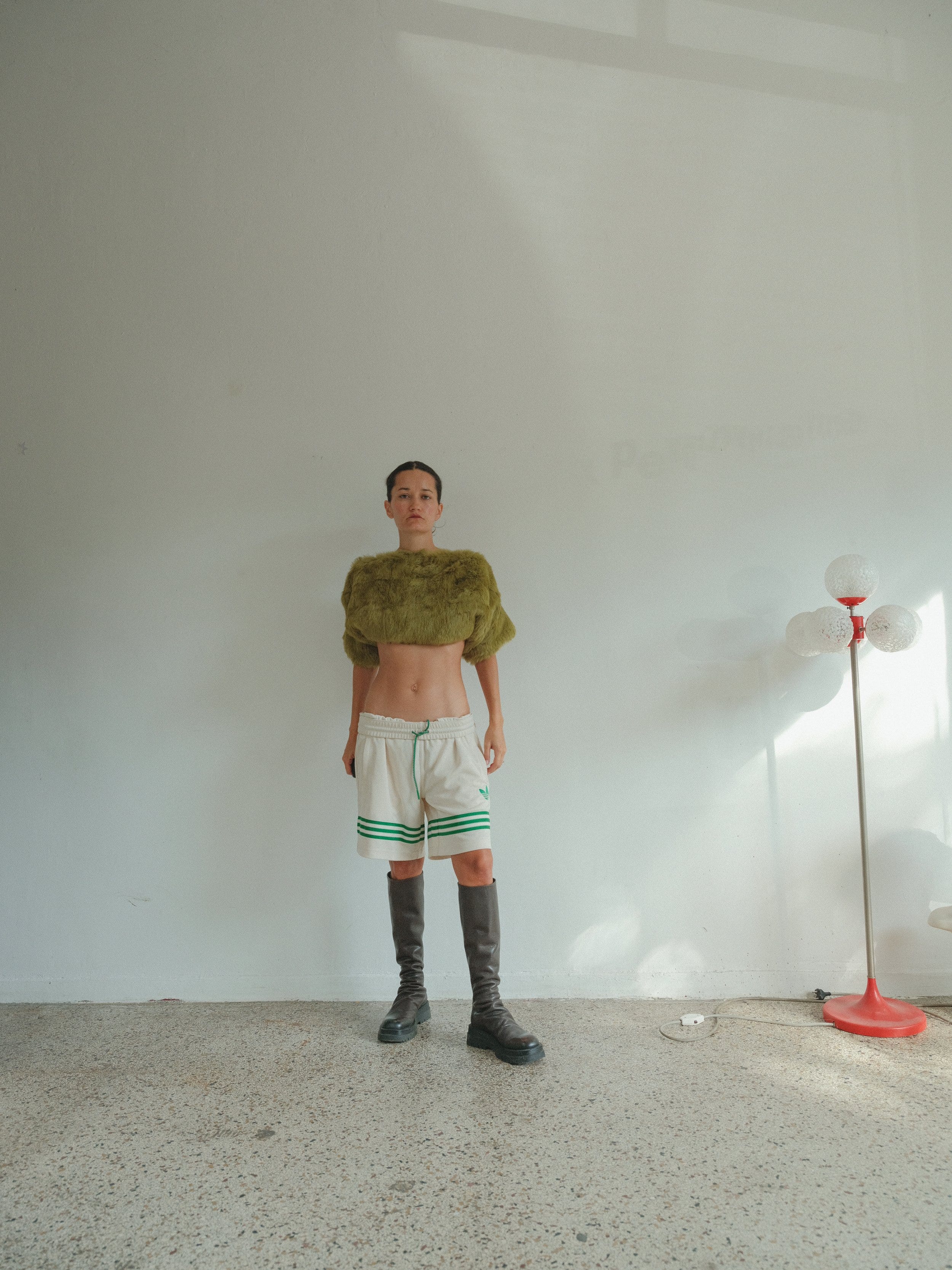
its an outfit such as this where I get iffy about it. Im not sure when would be the appropriate time to wear this outfit out in terms of weather and temperature and overall, its a clear example that they are prioritising juxtaposition over function. Could I see it in an editorial shoot? Definitely. The visual interest here is high, the colour story and texture is interesting however, to me, these types of outfits are prime examples of how juxtaposition can sometimes be used as a "shortcut" to making something visually striking, but without fully considering how the pieces work together in terms of functionality.
Styling an outfit with contrasting elements is an impressive challenge, but it loses its value when it doesn’t make sense beyond the visual appeal, its glaringly obvious that its for visual appeal only, however Id love to challenge this notion; true styling craft should and can introduce functionality to a visually interesting outfit, that to me is what makes a good stylist, no matter for editorial or everyday fashion. (especially for some editorial things)
This outfit feels like it was designed just to be "unique" without much thought about cohesion. It’s as if the goal was to cram as many contrasting elements together as possible, without considering if they actually work. I struggle to find the right weather or occasion for it, maybe fall… but even then, it seems off. Unlike other outfits where the pieces at least visually work together, this one lacks harmony. The focus seems to have been on shock value rather than creating a balanced, intentional look.
What frustrates me further is that, in some of the other outfits where I had doubts about their functionality, at least the pieces visually worked together. There was an effort to create harmony, even if the practicality was a bit off. In this case, however, it feels like the visual elements are competing rather than complementing one another. The pieces don’t speak to each other in a way that would create visual harmony.
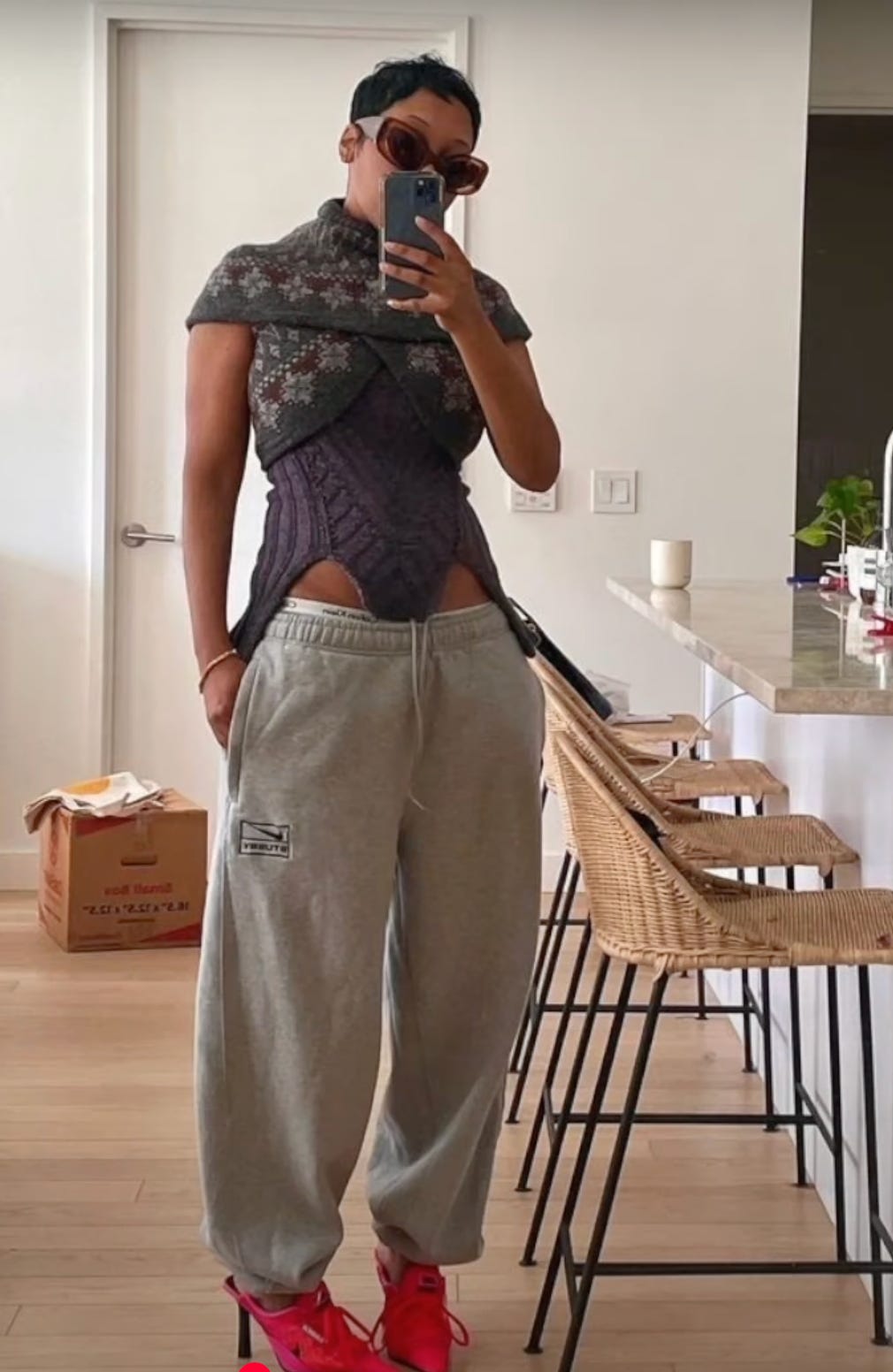
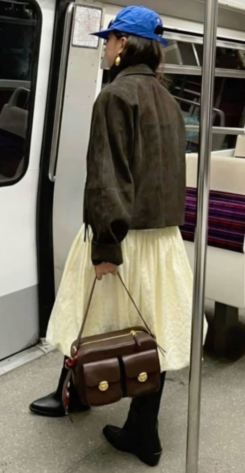
Here’s another example of something we saw everywhere in 2024: the skirt over pants trend. In theory, the outfit itself isn’t offensive. The colour story is consistent throughout, so it doesn’t become an eyesore. There’s definitely visual intrigue due to the silhouette; it’s unexpected, and that’s part of its appeal.
However, for me personally, I just can’t get on board with it. I find the look a bit too costumey for my taste , so for me, not a terrible outfit, but there is some bias on my side.
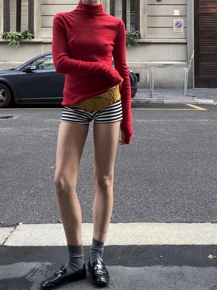
I do believe there’s a tasteful way to pull it off, and then... there’s the other way, which can often end up looking like pure chaos. It’s all about finding that balance. When done right, it can be bold and interesting; when done wrong, it can veer into “Carnage” territory:
EXHIBIT A:
Where Juxtaposition Gets It Right
While I think we’ve all seen this outfit formula online by now, and while I do get a bit bored of it, I can’t deny that it’s a great example of fashion's ability to play with contrasts. Take the Adidas track pants and blouse look. It works because it's not trying to serve a functional athletic purpose. This isn’t someone wearing track pants to run a marathon, then throwing on kitten heels just for the aesthetic.
No, it’s about choosing an athletic bottom as an alternative to a traditional feminine pant, without compromising comfort. The person isn’t running a race, they’re running errands, meeting friends, or just enjoying a casual day.
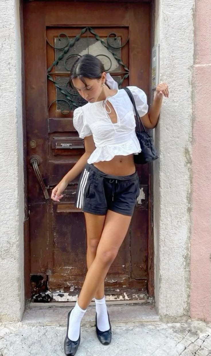
The key takeaway here is that they aren’t trying to combine sportswear and elegance for the sake of being fashionable, they’ve simply chosen an unconventional pair of pants. That makes it functional, and as long as you're not planning a rigorous physical activity, this look works.
I don’t have many qualms with this particular outfit; in fact, it strikes a good balance between style and function. It may not be something id personally put on my body, however I wanted to show you how it offers a cohesive level of coverage that makes it versatile enough to work in various situations.
It’s easy to picture when an outfit like this would make the most sense, think of those spring evenings when the sun has just set, and a cool breeze starts to roll in. You know, the kind of evening when it’s still warm enough for a light, breathable piece, but there’s just enough of a chill in the air to make you wish you had a little extra coverage.
The shoe choice is also something to watch out for, the loafers and sock combination dress up the outfit without sacrificing the functionally of this outfit, whereas a stiletto heel would. It adds a sense of realism which most online fashion pictures fail to encapsulate, making it easier to determine what is a Instagram outfit and what is a trendy & functional outfit for everyday life.
I know before I seemed to be bashing sweatpants with heels, but this in my opinion is how you do it right.
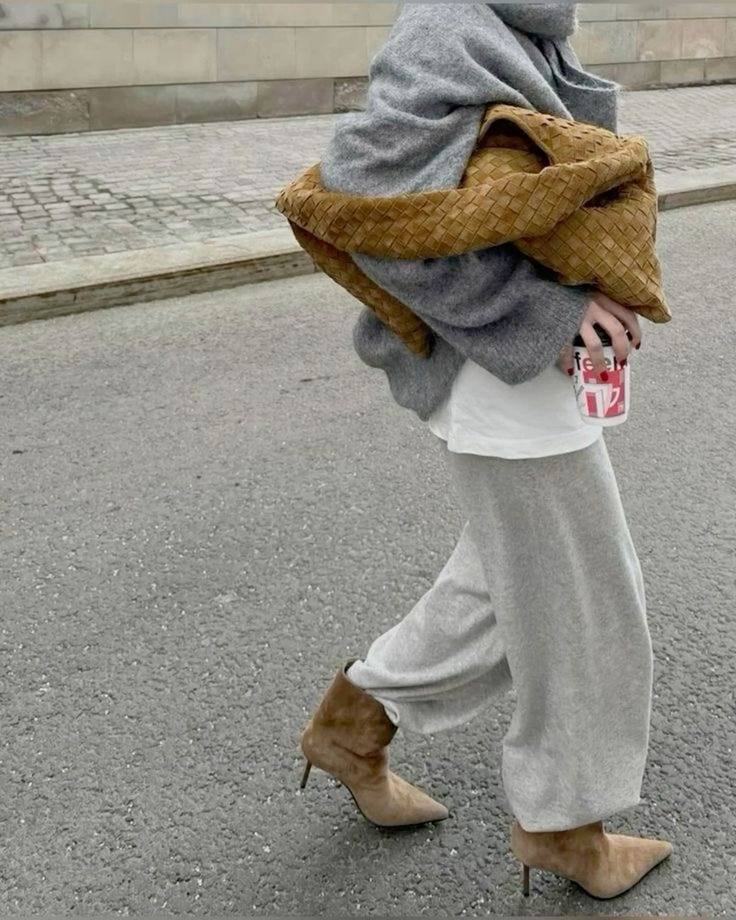
This outfit showcases a lot of visual harmony, primarily due to the way the colours, fabrics, shapes, and textures work together. While there is some juxtaposition in the types of pieces, they share a very similar colour, warmth, and material (both suede-like), creating a sense of balance. Meanwhile, the sweater, t-shirt, and pants are in grayscale tones, varying only slightly in texture and value. These subtle differences in texture and value make the whole ensemble feel less jarring.
The lack of stark contrast in color and texture allows this outfit to play with a few more unexpected elements without feeling overwhelming. This is a great example of how minimal contrast can give room for one or two bold choices, like the juxtaposition between the shoes and the pants. Even though I personally don’t think I could pull this off because the shoes disrupt the outfit’s overall functionality in my daily life, I do appreciate the creativity here.
If the wearer is comfortable in those shoes and can make them work with their daily routine, then I think it’s a visually interesting, unique look. The combination of elements creates a good balance, and while it’s a risk, it’s one that pays off better in terms of visual interest compared to the other outfit.

I can already imagine the comments on this one "How can this be practical?" But instead of jumping to conclusions about its face value, let’s take a step back and consider who might wear it and where they might wear it. For example, think about someone who lives near the ocean where the weather is always warm, like in Miami. This outfit could be perfect for them. It's practical in a place where it’s consistently hot and they might need something versatile enough to go from running errands to grabbing coffee with friends, and maybe even taking a spontaneous dip in the ocean afterward.
The mix of looser silhouettes like the pants paired with the tight-fitting swimsuit top offers a balance between comfort and style, creating enough visual cohesion that it doesn’t feel like a chaotic mess. It plays with that trend on the feminine vs masculine silhouette but its done correctly. This outfit is unconventional, but it works.
It manages to be bold without tipping into ridiculous territory that many outfits did in 2024. It’s a great example of a creative look that makes sense in the right environment, even if it might raise eyebrows elsewhere.
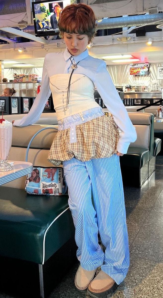
Does this mean you can only approach this look from a minimalistic, tonal angle? Absolutely not. For all my maximalist leaning friends (and notice I say "leaning"—we don’t want to go too far), this one is for you. Yes, there’s a lot of contrast happening here, but it doesn't feel overwhelming or chaotic. It avoids falling into the “clownish” category because it stays clean, both in terms of colour and pattern.
Oftentimes, when an outfit seems like it has too much going on, it’s usually because there’s either an overload of colours or competing patterns. That’s where the chaos starts. But in this case, the contrast is balanced enough that it feels intentional rather than random. It’s the sweet spot between bold choices and visual harmony.
maximalism (leaning) done thoughtfully!
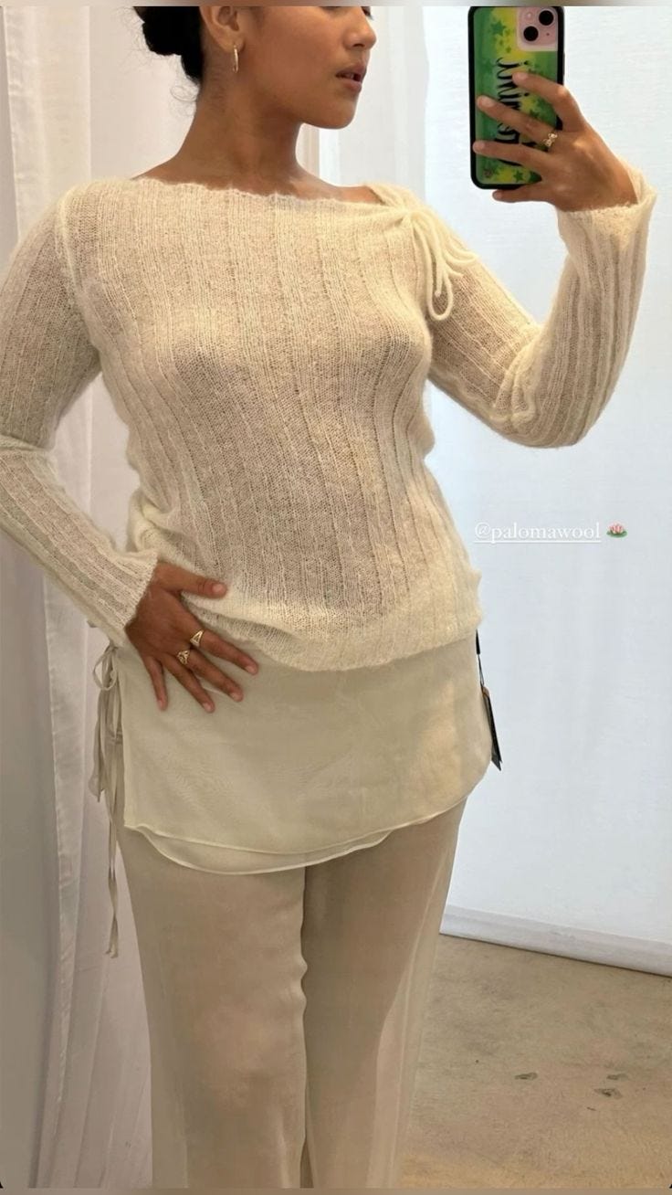
And even for my minimalist girls, this proves that you can still have fun with juxtaposition. You can tell in this outfit that everything works as one cohesive unit (key word here is unit). It’s not just a random layering of pieces thrown together because it’s trendy. Every element was carefully picked to match or complement one another. There’s real intention and thought behind this look. It’s a perfect example of how you can make a statement while keeping things simple, balanced, and beautiful. I find this look incredibly well executed and just stunning. (so is she btw omg)
So… Where Do We Go Wrong?
I think a lot of times as a society, we take things way too literally, and fashion is no exception. When a specific item or lifestyle starts trending, instead of adapting it to our own style, so many of us just buy the exact pieces we see online or pile on every trendy item in hopes of looking fashionable. But the most stylish people, the ones who seem effortlessly cool, aren’t necessarily obsessed with fashion. They’re aware of trends, sure, but they don’t blindly follow them. They know how to distinguish between a trend and a newer piece to incorporate, something that actually works for them.
That’s what we should take away from trends: not strict adherence, but adaptation.
Honestly, 2024 was a mess. Too many things were trending at once, and because people took everything at face value, so many outfits ended up looking more like costumes than something a real person would wear. Then there were those chasing a following, feeling like they had to wear trends exactly as presented just to gain attention.
This whole juxtaposed styling trend from 2024? At its core, it was about being seen. Not in a way that says, “I feel good in this,” or “I love how I look.” It wasn’t about beauty, confidence, or even personal style, it was about ego. It was about hoping others would find them cool, interesting, or unique. But in reality, conformity isn’t personality.
Performative fashion isn’t fashion. You make something fashionable. The item itself isn’t inherently stylish, it’s how you wear it, how you interpret it and how you make it yours.
Thank you for reading and engaging with my little rant and thank you for 632 subscribers!!! Im so overwhelmed but so happy that many of you deem my work as subscription worthy :3
xoxo,
Daughter Of Discourse
I love the reflection you have done on this topic. So many people trying to prove themselves and be seem, instead of understanding that personal style comes from in>out 💅🏻✨
Juxtaposition styling is my favourite because I can't simply just stick to one aesthetic! Wish more people would do it properly.